In the corporate world, there’s a silent killer lurking in meeting rooms across the globe. Its weapon of choice? Death by PowerPoint. We’ve all been there – staring at slide after slide of bullet points while the presenter drones on, reading verbatim what we can already see. But it doesn’t have to be this way.
As someone who has spent decades helping professionals transform their presentations from sleep-inducing monologues to engaging visual narratives, I’ve learned that the structure of your presentation matters far more than most people realize.
The Bullet Point Problem
Let’s address the elephant in the room: bullet points aren’t inherently evil. They’re like salt – useful in moderation, disastrous when overused. The problem arises when they become the default structure for every slide in your deck.
Bullet points signal to your audience that they’re about to receive a list of information. And lists, while organized, rarely tell compelling stories. They don’t create emotional connections or provoke thought. They simply… exist.
Start With Story, Not Slides
The most engaging presentations begin before PowerPoint is even opened. They start with a clear understanding of three essential elements:
- Who your audience is and what they care about
- What action you want them to take afterward
- The narrative journey required to get them there
Notice that “which template to use” or “how many slides I need” doesn’t appear anywhere in that list. Great presentations are born from great stories, not great slide designs (though those certainly help).
The Presentation Structures That Actually Work
Let’s explore some alternatives to the bullet-point parade:
The Problem-Solution Framework
This simple structure works beautifully for persuasive presentations:
- Begin by establishing a problem your audience recognizes
- Explore the implications of leaving this problem unsolved
- Present your solution
- Provide evidence of its effectiveness
- Clear call to action
Each of these sections might comprise multiple slides, but the narrative flow remains consistent throughout.
The Curiosity Gap
Humans are naturally curious creatures. We’re drawn to mysteries and compelled to solve them. Use this to your advantage:
- Open with a provocative question or surprising statistic
- Build tension by exploring the implications
- Gradually reveal information, maintaining suspense
- Deliver your key insight as a revelation
- Explain how this insight can be applied
This structure works particularly well for thought leadership presentations where you’re introducing new ideas or perspectives.
The Mountain Climb
This approach treats your presentation as a journey:
- Start at base camp (the current situation)
- Identify the summit (the desired outcome)
- Map the route (your proposed approach)
- Acknowledge obstacles (potential challenges)
- Celebrate the view (benefits of success)
This structure helps audiences visualize the journey from current state to desired outcome, making abstract concepts more concrete.
Visual Storytelling: Beyond Text
Remember that PowerPoint is a visual medium. Some of the most engaging presentations I’ve seen use very few words on slides, instead relying on:
- Powerful imagery that evokes emotion
- Simple diagrams that clarify complex relationships
- Data visualizations that make numbers meaningful
- Visual metaphors that connect abstract concepts to familiar ideas
Text should complement these visuals, not compete with them. Your spoken words provide the detail; your slides provide the visual anchor.
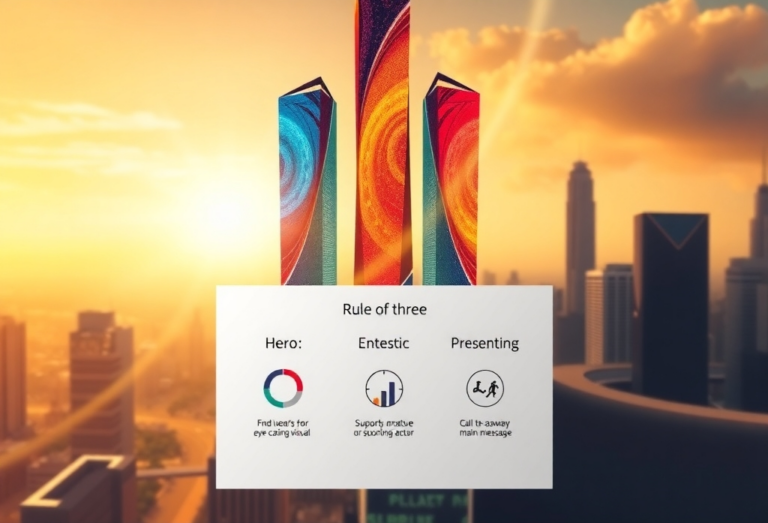
The Rule of Three
If you take nothing else from this post, remember this: humans process information in threes. We remember three points better than four or five. We find patterns in groups of three. We’re culturally conditioned to expect threes (think “ready, set, go” or “beginning, middle, end”).
Structure your presentation around three main sections. Within each section, aim for three key points. This creates a rhythm and pattern that audiences can follow without feeling overwhelmed.
Engagement is a Two-Way Street
Even the most brilliantly structured presentation falls flat if it doesn’t invite audience participation. Consider:
- Strategic questions that prompt reflection
- Brief discussion moments (even in large groups)
- Simple polling or feedback mechanisms
- Moments of levity or surprise
Remember, your audience’s attention is a finite resource. Asking them to passively absorb information for 30+ minutes is a recipe for glazed eyes and forgotten content.
The Bookend Principle
Cognitive science tells us that people remember the beginning and end of experiences most vividly. Use this to your advantage:
- Begin with something memorable – a story, a surprising fact, or a provocative question
- End with a clear, actionable conclusion that ties back to your opening
This “bookend” approach creates a sense of narrative completion and helps your key messages stick.
Conclusion: Structure Creates Freedom
The irony of presentation structure is that having a clear framework actually gives you more freedom, not less. When you know the story you’re telling and the path you’re taking, you can focus on delivery, engagement, and connection rather than worrying about what comes next.
So before you open PowerPoint for your next presentation, grab a notepad instead. Map your narrative. Identify your three key points. Understand the journey you want to take your audience on. Then – and only then – think about how your slides can enhance that journey.
Your audience will thank you. And not just because they’ll stay awake.
Paul Mansfield is a PowerPoint designer with over 30 years of experience transforming corporate presentations from boring to brilliant. He believes that great presentations change minds, inspire action, and occasionally prevent naps. Learn more at paulmansfield.net