In the ever-evolving world of presentation design, we’ve witnessed a significant shift in how businesses communicate their ideas visually. As a presentation designer who has worked with countless clients across industries, I’ve observed a clear trend: the classic “less is more” philosophy has matured into what I call “meaningful motion” – a sophisticated approach where every element serves the narrative purpose.
Beyond Static Minimalism
Minimalism in presentation design isn’t new. For years, we’ve embraced clean layouts, ample white space, and reduced text density. This approach emerged as a reaction to the cluttered, bullet-point-heavy slides that dominated corporate presentations for decades.
But today’s minimalism isn’t just about reducing elements – it’s about making each element work harder.
Modern presentation design combines the cleanliness of minimalism with purposeful animation and transition effects that enhance rather than distract from the message. This evolution transforms static slides into dynamic storytelling vehicles where movement has meaning.
Why Meaningful Motion Matters
In my work with clients on Upwork, I’ve seen firsthand how strategic animation can dramatically improve audience engagement and message retention. Here’s why this approach works:
- It directs attention: Strategic motion guides your audience’s eyes exactly where you want them to look, when you want them to look there.
- It builds cognitive connections: When information appears in a thoughtful sequence, it helps audiences process complex ideas more easily.
- It evokes emotion: Subtle, well-executed animations can trigger emotional responses that make your message more memorable.
- It enhances understanding: Complex data or concepts can be broken down into digestible pieces through sequential revelation.
Implementing Meaningful Motion: Practical Tips
If you’re looking to incorporate this approach into your presentations, consider these guidelines:
Start with Purpose, Not Effects
Before adding any animation, ask yourself: “What does this motion communicate?” If you can’t answer that question, the animation probably doesn’t belong. Every transition should serve the narrative, not just look impressive.
Maintain Consistency
Develop a “motion language” for your presentation – a consistent set of animation types and speeds that creates a cohesive experience. Jarring changes in animation style break the audience’s focus.
Respect Cognitive Load
Even the most beautiful animations become distracting if overused. Allow moments of stillness for complex information to be absorbed. Remember, animation should clarify, not complicate.
Prioritize Subtlety
The most effective animations are often the least noticeable. Gentle fades, slight movements, and thoughtful timing create a sense of flow without calling attention to the animation itself.
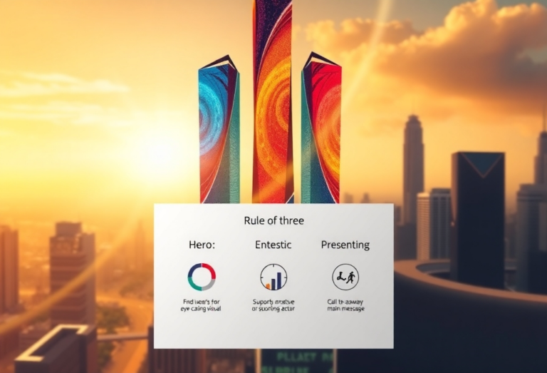
Real-World Example: Data Visualization
One area where I’ve seen meaningful motion make a significant impact is data visualization. Rather than presenting a complex chart all at once, revealing data points sequentially while explaining each element transforms overwhelming information into an accessible story.
A financial services client recently came to me with a presentation containing a slide with five overlapping trend lines. By breaking this into a sequence where each trend appeared as it was discussed, audience comprehension increased dramatically. The data hadn’t changed – only the presentation method had.
Finding the Balance
The art of meaningful motion lies in striking the perfect balance. Too much animation creates cognitive overload; too little misses opportunities to enhance understanding.
I often tell my clients that the goal isn’t to create a presentation that people remember for its animations, but rather one where the animations helped people remember the content. When done correctly, audiences shouldn’t even consciously notice the transitions – they should simply absorb the message more effectively.
Looking Forward
As presentation technologies continue to advance, we’ll see even more sophisticated implementations of meaningful motion. Interactive elements, responsive animations, and personalized motion paths are already emerging in cutting-edge presentations.
However, the fundamental principle will remain the same: every element, static or dynamic, should serve the narrative purpose. Motion for motion’s sake will always detract from your message.
Final Thoughts
The evolution from “less is more” to “meaningful motion” represents a maturation in how we think about presentation design. It acknowledges that while simplicity remains crucial, thoughtful animation can transform passive viewing into active engagement.
For businesses looking to communicate complex ideas effectively, this approach offers a powerful tool. When every element serves the narrative – when motion becomes meaningful – presentations transform from information delivery mechanisms into compelling storytelling experiences.
Paul Mansfield is a PowerPoint designer with over 30 years of experience transforming corporate presentations from boring to brilliant. Find him on Upwork or contact him directly on this site.